Contact Us

Have questions?  Use this form to contact us.

We will respond to you as soon as possible.

Thank You,

Gary Detonnancourt


Harrisville, RI 02830
United States

More Than A Snapshot provides online photography education.

Booth Bay Harbor 2013-5410-color enhanced.jpg

Blog

This is the blog for More Than A Snapshot's Online Photography Classes.  In these blog posts I will give photography tips, tutorials, and show images.

Filtering by Category: Composition

6 Tips to Improve Your Landscape Images

Gary Detonnancourt

Guest blog post by Marion Faria

Guest Blogger Marion Faria

Guest Blogger Marion Faria

I am a passionate and quirky photographer concentrating primarily on landscape photography.  My images have been printed in NANPA Expressions magazine. The image of The Road to Fitzroy was the cover image for Lonely Planet's "Best in Travel" 2015 book.  I have won numerous Spider, black and white awards, also, images of the day at earthshots.com, Shutterbug Magazine and Bing. Finalist for image of the month at Popular Photography.  My stock images are represented by Getty Images.  http://marionfariaphotography.com/


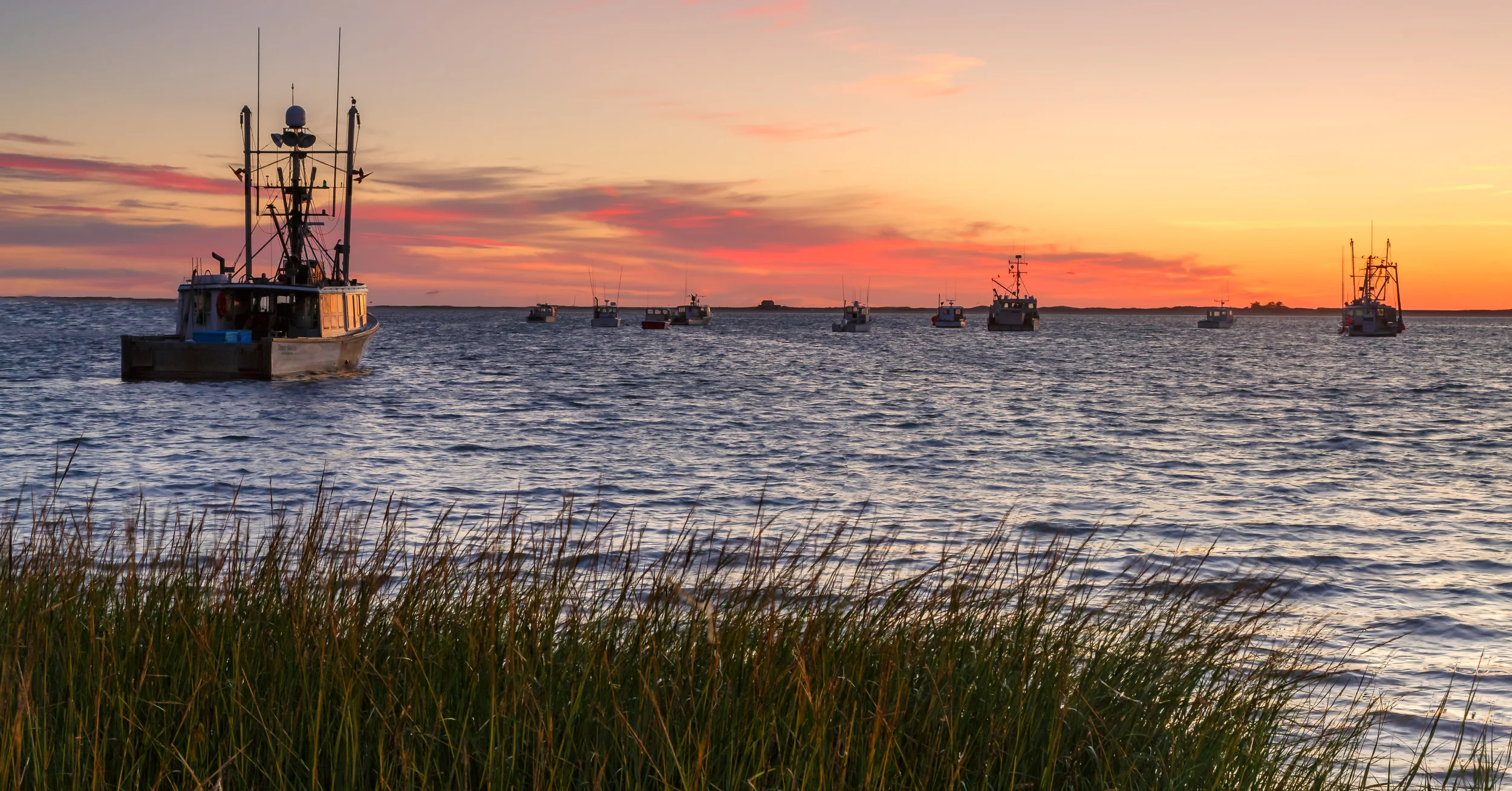
1. The "rule of thirds", which almost every photographer has heard about, can work most of the time.  If you are struggling with composition, it would be wise to use this as a starting point until you are more confident. It is based upon the Golden Mean which was used by painters for many centuries as a guide to composition.

The image above demonstrates the use of the "rule of thirds"...it is beneficial to a composition to place a major subject on one of the crossed lines.  

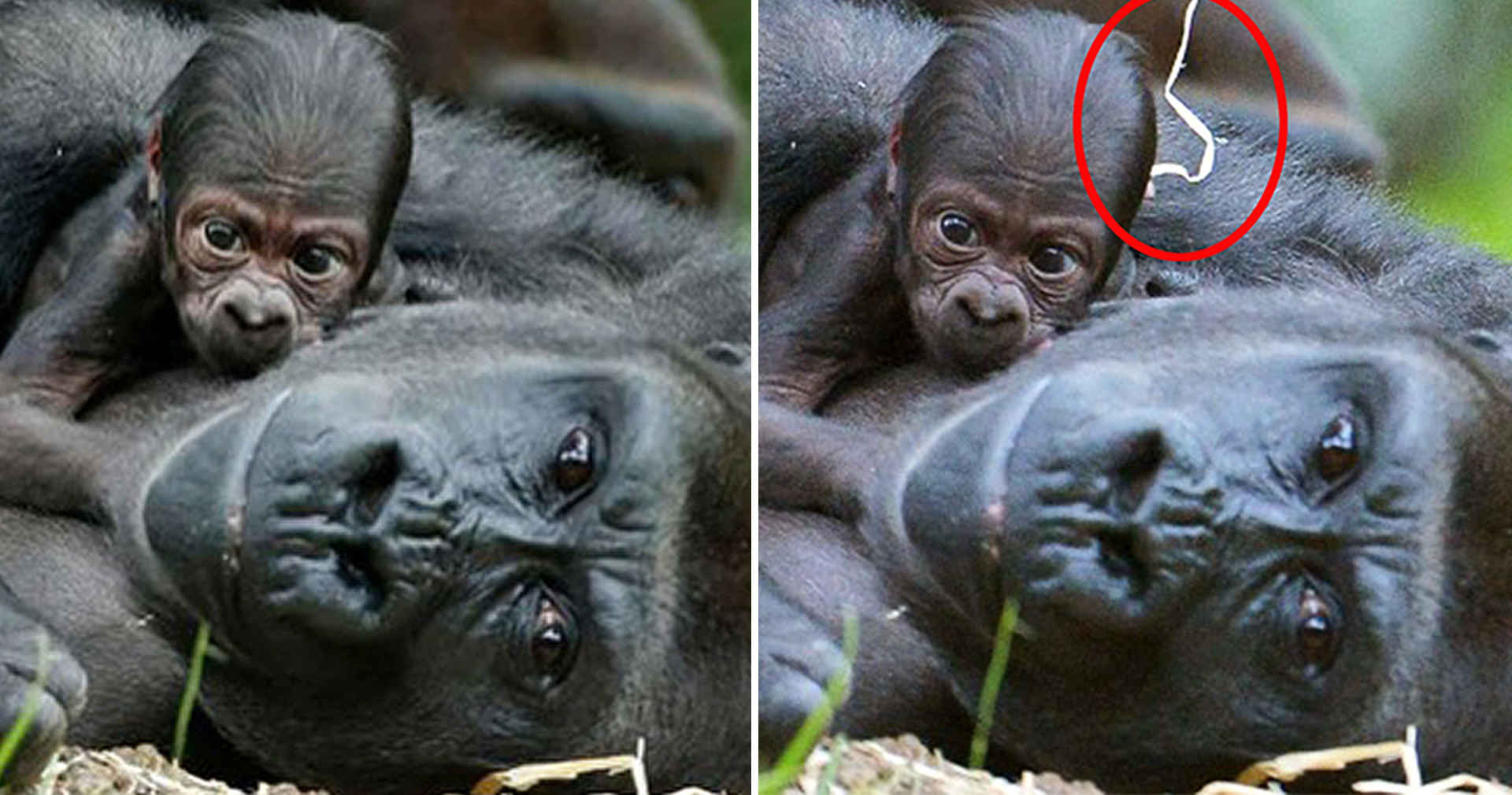
2. The composition of landscapes can be improved by using certain graphic elements.  Some elements draw the eye into an image, others add strength and tension to an image...it is important to recognize graphically what is in your composition.

The illustration above gives you an idea of the elements that can improve an image.

3. As a landscape photographer, I shoot almost entirely in Aperture Priority, switching to Manual as needed, which isn't very often, usually as night approaches.

4. When shooting landscapes, you want to use the lowest native ISO for your camera, mine is 100, some are 200.  Using a low ISO is important for helping to avoid excess noise in an image.  Using too much noise reduction can diminish the quality of an image.

5. Compose vertically as well as horizontally; it gives you another option and can improve a composition.

Lake Louise, Banff National Park, Alberta, Canada

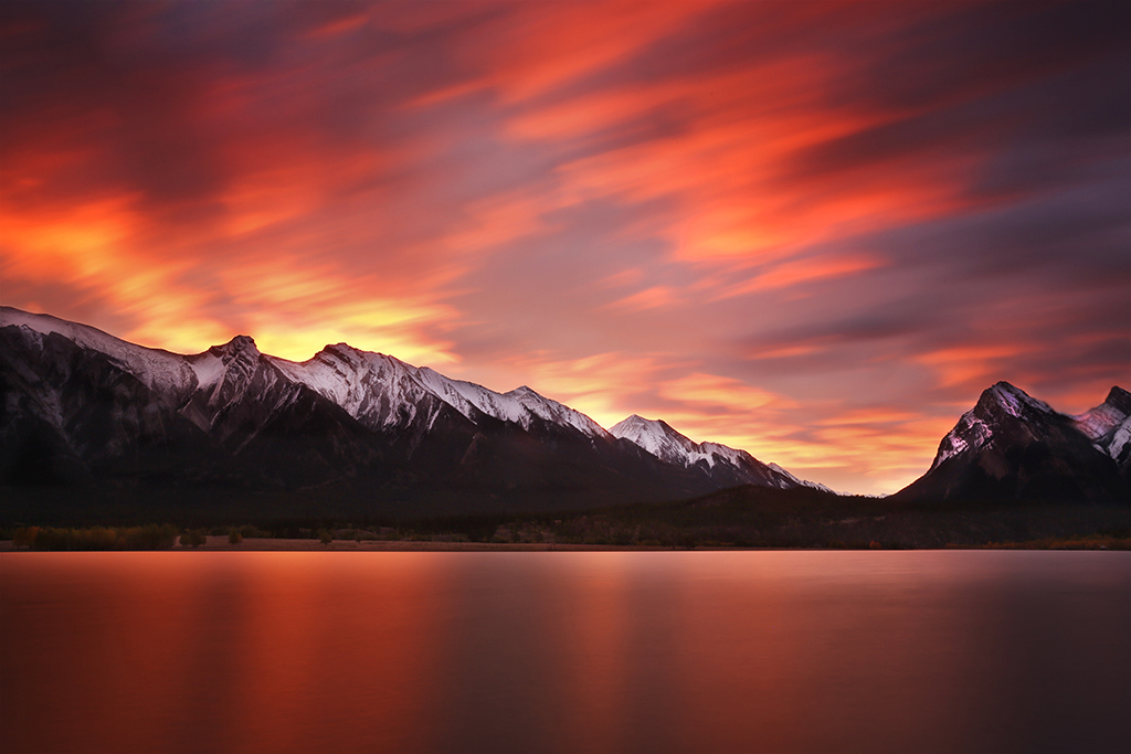
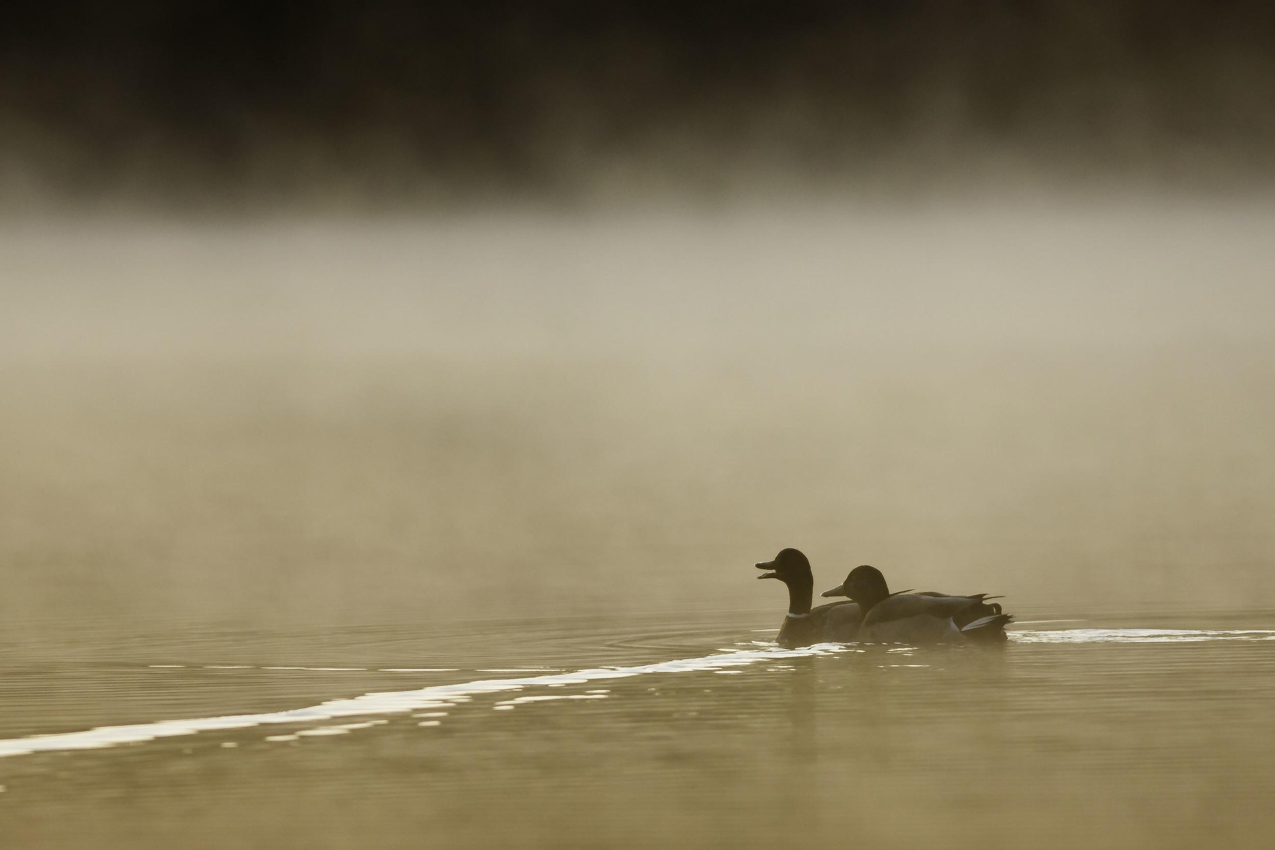
6.  Of course the most important thing of all, in landscape photography!  Wait for the best light.  The light is what will elevate an image from ordinary to extraordinary. Notice the difference between images 4 and 5.  In image 4 the light is dramatic, as is the sky; in image 5, the light is good on the mountain peak but flat everywhere else.

Canadian Rockies, near Banff

Mount Rundle from Vermillion Lake, Banff National Park

How to Find and Save Photo Locations that Don't Suck

Gary Detonnancourt

How to Find and Save Photo Locations that Don't Suck

You may not even need to use google maps because The Photographers Ephemeris uses Google Maps and has most of the same features.  Plus TPE has a way to save locations and it has a way to share locations on photohotspots.com

Simplify the Image... as long as your not a Photo-journalist

Gary Detonnancourt

This article is about improving your compositions by removing distracting elements.  This practice is acceptable in most photographic contests unless you are a photojournalist.  Press photos should be as accurate to the situation as possible.  Always check the rules before entering a contest.

The Herald Sun’s David Caird was in contention for the Nikon-Walkley Press Photographer of the Year award as a finalist, when a fellow photographer who just happened to shoot the same scene noticed differences between Caird's version of the photograph and his own.

Supposedly, there was originally a piece of straw that Caird had cloned out in post-processing. While this did not change the interpretation of the photograph, the competition's rules did explicitly state that:

"No cloning, montaging or digital manipulation other than cropping, ‘digital spotting’, burning and dodging is permitted."

As you can see above, David had the right idea, the photo is better with the straw cloned out.  Too bad it was against the rules, but at least he voluntarily withdrew, once he realised the problem.

When you compose an image try to make sure there are no distracting elements in the scene.  If you see one and you can remove it with your hands it will make your life much easier than having to clone it out in Photoshop.  However, there are plenty of situations in which you can't go and remove the distraction, so Photoshop may be your only option.

I thought the houses and flag behind the cabanas were distracting so I removed them in my final image.

I could have removed the trees as well but I felt like they were a natural part of the scene.

This was my original image and I thought it had potential but it had too many distractions and the lighthouse was in a bad position and it was too small.

I made the lighthouse a little bigger and moved it to the left side of the image to balance with the small boat.  I also cloned out everything in the water so the focus would stay on the boat and the lighthouse. 

When photographers are making art, they should feel free to use the benefits of Photoshop to their fullest.  Simplifying a scene can help you to get the most out the visual experience.  However, there are times, such as in press photos, when major photo manipulations are not appropriate.

You Don't need Exotic Locations to Make Great Images

Gary Detonnancourt

E-Book Review of Close to Home by Stuart Sipahigil

This was an e-book review I did back in 2013, but I think it relates to composition month very well because a big part of making a good composition starts with a great subject.  Finding subjects can be difficult at times especially when you have to stay close to home.  It's easy to get board with locations you know well.

Try to turn this problem into an advantage.  Since you know the places so well, visit them more often and shoot them at different times of the day or in a different season.  Try to find interesting ways of showing a scene that is common to you.  Essentially you will have to work harder to find your image and you'll have to be more creative.

Give it a try and post your images in the comments below.  Also, tell us if you prefer locations you know well or places you haven't visited before, and why?

Aspect Ratio, Composition and Cropping

Gary Detonnancourt

Aspect Ratio, Composition, and Cropping Click this link to get more photography tips: http://bit.ly/1SKbmlH

The common 3:2 aspect ratio of most digital single lens reflex cameras was invented back in the 1920's by Oskar Barnack, when he designed the first 35 mm rangefinder for Leica.  We have been stuck with this aspect ratio ever since.  The reason I say stuck is because this aspect ratio can make composition a bit more difficult because it can easily have too much width in the landscape orientation and too much height in the portrait orientation.  

The 3:2 aspect ratio in the portrait orientation often has too much space at the top and/or bottom of the image.

The height is especially a problem for landscape photographers shooting vertical images because it often includes too much empty space in the ground or sky.  For this reason, many film landscape photographers preferred the large format or medium format cameras because they used 5:4 and 4:3 aspect ratio respectively.  These formats not only provided better quality for large prints but allowed for easier landscape compositions due to their aspect ratios.

3:2 aspect ratio

Micro four thirds cameras offer in interesting alternative because they use the 4:3 aspect ratio.  While other modern cameras try to solve this problem by allowing you to shoot the images in different aspect ratios.  The only problem with this is they are accomplishing this trick by cropping, which means you are losing some resolution.  With today's super high-resolution cameras like the 50 megapixel Canon 5DS you could easily accomplish the same thing by cropping the image in your image editing software and end up with a cropped image that still has high resolution.

4:3 aspect ratio as if it were shot on a micro four thirds camera.

Most modern cameras offer different image sizes in-camera, though all they really do is crop the top and bottom or sides. There are a few digital cameras that have sensors bigger than the lens’ image circle, which allow the diagonal angle of view for a given focal length to be maintained when changing crop; the main one of these is the Panasonic LX series of cameras. Put one of these on a tripod, slide the aspect ratio switch on the lens barrel and you’ll notice that the horizontal field of view gets wider than the 4:3 option, even though this is the native aspect ratio of the sensor. (It also means that you don’t suffer as much of a resolution decrease as you’d expect when changing aspect ratios). There is no point in shooting in another aspect ratio if all the camera does is throw away the extra pixels; you’re better off capturing as much information as you can at the time of shooting and then deciding later what crop would work best (assuming, of course, that you didn’t compose correctly at the time.)
— MING THEIN

3:2 can be too wide for some subjects.

4:3 makes it easier to eliminate the extra space on the sides.

The solution to the 3:2 aspect ratio for the DSLR shooter is going to depend on the situation.  In general, do your best to fill the frame with your subject, but keep in mind you may need to crop to another aspect ratio in post-processing to eliminate the extra width or height.  This may in turn affect your framing choice when taking the image.  The other option is to fill the frame but the carefully compose your background.  If the background of the image provides useful space in the image, it may not need to be cropped.

I have to make a correction to my video.  The 1:1 aspect ratio doesn't work with the rule of thirds.  The rule of thirds is based on the golden mean which is only useful for rectangles.  Square images work well with centered subjects and subjects with shapes, such as circle, triangles, and rectangles.  To learn more visit this article on how to shoot 1:1 aspect ratio images.

The square format seems to work best with subjects like portraiture, the nude, landscape, still life, architecture, details and abstracts. These are all artistic subjects – which is perhaps why the square format is popular with fine art photographers.
— Andrew Gibson

The viewers eye tends to move around a square frame in a circular path.

Click here to see more examples of 1:1 images.


Common Aspect Ratios:

Aspect ratio: image width/ image height, with the long dimension first.

There are six common aspect ratios for cameras today (and as many as you like if you use the crop tool, but that’s another subject for another day):

1:1 – Square format, traditionally the realm of 6x6cm Hasselblads, and now popularized by various mobile apps.

5:4 – Large format and sheet film cameras, mainly 8×10″.

4:3 – Broadcast television and video used this aspect ratio, originally in 640×480 pixel resolution; small sensor cameras and compacts (which inherited early video CCD architecture) have been using this aspect ratio ever since. Four Thirds and Micro Four thirds are the larger consumer formats to use it; in medium format there’s also 645 which has the same aspect ratio for both film and digital.

3:2 – Double a movie frame; famously invented when Oscar Barnack rotated the film through 90 degrees and doubled the width of the frame to create the 24x36mm ‘full frame’ 35mm camera format. Almost all larger sensored DSLRs use this today.

16:9 – HDTV format; not a native aspect ratio for digital still cameras, but useful to provide a more cinematic feel to an image.

2.35/2.40:1 – Motion picture widescreen for feature films; very rarely used for still photography, and there are certainly no dedicated digital still cameras that offer exclusively this format. Not only is it extremely wide, if you’re cropping down from a 4:3 sensor you’re throwing away more than half of your image.

6 Composition Tips for Bird Photography

Gary Detonnancourt

Composition Tips for Bird Photography

Click this link to get more photography tips.

Details really do matter.  I find that people that specialize in something tend to really focus on details and that's what often separates them from the rest of the crowd.  I'm a bass fishermen, and I've seen two people in the same boat using the same bait and one person is catching fish and the other isn't,  something as simple as changing the size of the bait, can mean the difference between catching a fish or going home hungry.  The same holds true for photography, in this case, Michael specializes in bird photography and has learned through experience which small details can really improve his images of birds. 

1.  The bird should be facing directly toward the viewer or at a profile view, not flying away from the viewer.

Black Crowned Night Heron - Image by Gary Detonnancourt

Black Crowned Night Heron - Image by Gary Detonnancourt

2.  Leave room for the birds movement in the image.

Osprey - Image by Gary Detonnancourt

3.  It's often helpful to see the birds feet.

Heron - Image by Gary Detonnancourt

4.  Leave room in your composition for the feet, even if they are under water.

Egret - Image by Gary Detonnancourt

Egret - Image by Gary Detonnancourt

5.  Show a bird with some personality.  A head tilt or other interesting guesture can really add life to an image.

Mallard - Image by Gary Detonnancourt

6.  Try to capture a catch light in the birds eyes.  This can be done with front light, side light, or a fill flash.

Image by Gary Detonnancourt

Post your images and comments below.

Composition Webinar Replay with Ron Rosenstock

Gary Detonnancourt

Composition Webinar with Ron Rosenstock Click this link to get more photography tips.

The Rule of Thirds

Gary Detonnancourt

Some people hate to follow the rules.  The good news is, in photography you don't always have to because the "rules" are meant to be broken.  Following the "rules" is a helpful way to get started and they will very often help you to create a pleasing image.  The only problem with the rules is they can limit your freedom of expression and creativity.  "They" say once you know the rules you know enough to break them and still get away with a pleasing image, so here we go let's start with the most basic rule of composition the rule of thirds.

The tic-tac-toe type grid can help you to figure out where to place your subjects.  Image by Gary Detonnancourt

Place the main subject or subjects on one of the 4 inside cross points.  Avoid putting your subject dead center in the image because it tends to be a boring composition.  Occasionally you can get away with putting your subject right in the middle if the subject is very symmetrical like in the image below.

I call the four cross points the sweet spots for placing a subject.  You can actually turn on a grid like the one above in most cameras'.  This will help you frame up your shot right in the camera.  

How to set up grid lines for a Canon camera.

Grid lines are helpful when aligning subjects vertically or horizontally. With a Canon Rebel T3i, there are three grid options: None, 3 x 3, and 5 x 5. This feature is called Grid Display in the Menu options.

Step 1: Press the Menu button.
Step 2: Navigate right, to the fourth tab.
Step 3: Select "Grid display" and then your preferred options: None, Grid 1 (3x3) or Grid2 (5x5).
Step 4: Make sure you're in Live View to be able to view the Grid overlay.

How to turn on grid lines on a Nikon, like the D300.

The question now becomes which of the four sweet spots should you use when deciding where to place your subject.  When it comes to the left or right side, you should go with the right side if you live in a country that reads from left to right.  Our eyes are used to reading an image, in the same way, we read words.  If you place the subject on the left side, our eyes come into the image on the left and then stop on the subject and we don't really look at the rest of the image.  Whereas, if you place the image on the right side our eyes come into the image from the left, go through most of the image and then run into the subject.  Don't worry if you accidently shot the subject on the right side, there is an easy was to fix it in Photoshop.  Here is an example:

In Photoshop click on Image>Image Rotation>Flip Canvas Horizontal

This is the image after it has been flipped, now your eyes have time to come into the image and then run into the butterfly.  Image by Gary Detonnancourt

When trying to decide between the upper third or lower third sweet spot I often go by whichever one will maximize the most interesting part of the image.  If the sky is the most interesting I will use the lower third and if the foreground is more interesting I will use the upper third as shown in the images below.

Notice the horizon is in the lower third because the sky is more interesting than the foreground.  Image by Gary Detonnancourt

In this image, the horizon is in the upper third to show off an interesting foreground.  Image by Gary Detonnancourt

Homework:  Go through your image collection and pick out some images to post below, in the comment section of this page, that meet the rules shown above.  Also, feel free to ask questions, make suggestions or comments about this article.

I hope you found this article helpful,

Gary Detonnancourt

morethanasnapshot.com